The most well-known indicator of inflation is the Consumer Price Index (CPI), which measures the percentage change in the price of a basket of goods and services consumed by households.
 . Featured Image: View of Martin Place from the balcony of the Government Savings Bank of New South Wales, 1928.
In Australia, the CPI is calculated by the Australian Bureau of Statistics (ABS) and published once a quarter. To calculate the CPI, the ABS collects prices for thousands of items, which are grouped into 87 categories (or expenditure classes) and 11 groups. Every quarter, the ABS calculates the price changes of each item from the previous quarter and aggregates them to work out the inflation rate for the entire CPI basket.
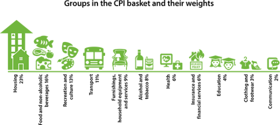
Pictured: Selected groups in the CPI basket and their weight when compared against each other. In deciding which goods and services to include in the CPI basket and what their weights should be, the ABS uses information about how much – and on what – households in Australia spend their income. If households spend more of their income on one item, that item will have a larger weight in the CPI. For example, the ABS included smart phones in the CPI to reflect consumers taking advantage of advances in technology. Data on household spending across all items is only available approximately every five years or so.
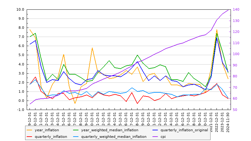
The shortcode of [inflation] returns the following graph:
Data returned in the graph various depending on various shortcode attributes.
Shortcode Attributes
frequency
Available options are
yearandmonth(monthreturns quarterly data).
points
The number of data points to returns in the graph. Defaults to 24.
start and end
To define a specific period you should use the
startandendattribute. If providing either of these values it's expected to return the number ofpoints, otherwise the graph will return the default of 24.
fields
Available field options are as follows:
cpi, year_inflation, year_inflation_exclude_interest_tax, year_inflation_exclude_volatile_terms, year_tradables_inflation, year_tradables_exclude_volatile_terms_tobacco, year_non_tradables_inflation, year_non_tradable_exclude_interest_deposit_loan, year_weighted_median_inflation, year_trimmed_mean_inflation, quarterly_inflation_original, quarterly_inflation, quarterly_inflation_exlude_interest_tax, quarterly_inflation_exclude_volatile_terms, quarterly_tradables_inflation, quarterly_tradables_exclude_volatile_tobacco, quarterly_non_tradables_inflation, quarterly_non_tradables_inflation_exclude_deposit_loans, quarterly_weighted_median_inflation, quarterly_trimmed_mean_inflation.The default graph returns the following:
cpi,year_inflation, year_weighted_median_inflation, quarterly_inflation_original, quarterly_inflation, quarterly_weighted_median_inflation.More complex candlestick, bar, and pie graphs are available that detail the weight of particular expenditure types, and these graphs are detailed within Yabber
. Note that all graphs are copied to the client website so all images are hosted by you and only updated when required (usually based on
frequency, although any change will return a new graph).A maximum of 5 plots in addition to CPI will be returned.
Graph Field Definitions
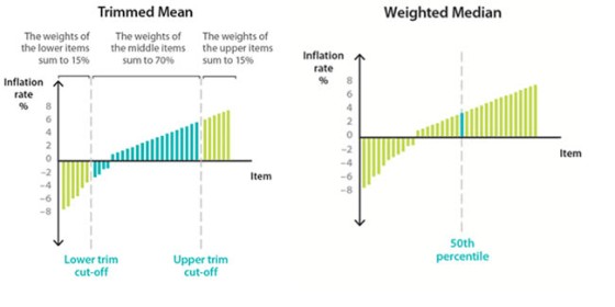
Trimmed mean is the average rate of inflation after ‘trimming’ away the items with the largest price changes (positive or negative). It is the weighted average of the middle 70 per cent of items. Weighted median is the inflation rate of the item at the middle of the price changes in the CPI basket (the 50th percentile by weight).
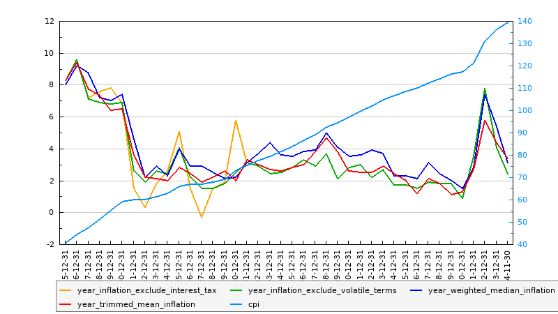
If we add the trimmed inflation data along with some of the more relevant yearly data, and we remove the quarterly, the following graph will be returned:
Shortcode used was [inflation points="40" fields="cpi, year_inflation_exclude_interest_tax, year_inflation_exclude_volatile_terms, year_weighted_median_inflation, year_trimmed_mean_inflation"]
RESTful API
The RESTul API returns inflation data and aggregated data sourced from other real-time databases (such as interest rates and employment) to provide the data necessary to graph virtually any monetary or economical scenario. Various endpoints are returned in each response to query additional relevant data sources for the defined period. Data is returned in various formats (based on the format parameter in the request) so you may easily use other charting tools, such as Google Charts or our own JavaScript graphing plugin.
Documented within Yabber  , the API returns paginated responses with data dating back to 1922.
Conclusion
The graphs are used by our clients in the resource section of their website that details various aspects of monetary policy. The graphs and integrated data lends itself to the broad expertise and authoritativeness that we like all our clients to demonstrate by way of all their online resources.
Finance clients will find value in using the graphs as part of their own content creation strategy, and we certainly include the graphs in our own article submission service.
The Inflation API is one of well over 100 data sources we make available to clients and fully integrate with their leading online and website experience.


