In this article we're going to show you exactly why our standard Facebook and organic funnels returns far more leads than competing products. Without exposing our closely guarded secrets, we'll show you a mechanism that'll optimise just your top of funnel subscription, or that part of the funnel that ingests a user into your early funnel journey. What we're describing is just one of about 20-or-so funnels routinely applied by mortgage brokers.
It needs to be understood that once a user is subscribed to an experience, or a user has made early contact, a deep, immersive, engaging, and education-based journey continues to apply, and it's the latter funnel excursion that is just as important as the initial transaction.
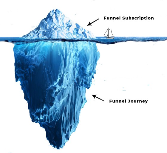
Pictured: The subscription-based top-of-funnel experience is the tip of the iceberg. It's the follow-up, and the relevance of the follow-up education-based communication, that'll have a significant impact on conversions. The nested funnel is discussed only in brief towards the end of this article.
Industry Representation is Poor: If you're familiar with the ads many brokers use you'll invariably be familiar with the ridiculous '30-second quiz' (almost always used by lead generation charlatans) that purports to 'qualify' a potential client... although it absolutely has the opposite effect - it disqualifies the broker, disconnects a user from your experience, doesn't return results to a user, and the whole thing is usually non-compliant and discombobulated mess. You're probably also familiar with the claims of a 'proprietary' lead generation system that delivers 'qualified' leads into your pipeline when the experience provided by almost all companies in the finance space are carbon copies of each other, and they all deliver an experience comparable to one we provided over 20-years ago (and none that return better results than our free Funnels product). We're going to show you exactly what they're doing, why they don't come close to optimising your marketing budget, and then we'll introduce a few of the options our clients have used to generate results that improve upon real-world conversions.
How long will it take to implement the funnel we're describing in this article? About 5 seconds. If you're using our complimentary Funnels plugin, you simply activate the plugin and the necessary pages are created (an experience identical to that described below is created). If you're a client, you may create the experience via the Solis module in Yabber. Note that at the time of writing, we're using the holiday period to update both the plugin and Solis module, so they're both offline.
Our broker clients alone return over 12'000 leads every month, and we're going to show you exactly why some are achieving conversions well over 30%.
Introduction
It should be stated first and foremost - and for probably the hundredth time - that every page on your website is a landing page of sorts. Traffic can come from anywhere, and the entry point to your website can potentially be any page on your website, so every single page of your website needs to provide a conversion opportunity of some kind. The subscription method we're detailing on this page doesn't apply to just landing pages - it applies to every occurrence of every form on your website.
Our mortgage broker website, coupled with Yabber, supports this 'every page' ideology in a way that potentially explodes existing traffic, and as an SEO-optimised website with well over 200 primary pages, it has the capacity to generate new business and other organic opportunities.
Every Page Video: To support video, we provide a number of systems for point-and-click inclusion of video placed in various locations on every page (with a standalone system for the lender archives ). Other systems provide for the inclusion of video based on the user arriving on your website via a specific email campaign. Videos and webinars objectively improves your results.
Our broker website framework supports highly advanced features that responds to the behaviour of your traffic. For example, website content has the capacity to changes shape based on the borrowing objective or resolved understanding of your funnel participant - something we've come to see an absolute necessity in a real funnel. We introduce a summary of advanced conditional features in a scheduled article.
The Pedestrian Experience
The typical 'funnel' used by many, and used by the entire leadgen crowd, isn't a funnel - it's simply a subscription form, and it's something you could build yourself in a few minutes. Every now and again you'll see somebody use a 30-second quiz that purports to return results (but returns nothing), and some forms claim to 'qualify' the user - both claims are akin to baiting since no results are returned, and no qualification is applied. In terms of lead-generation companies, they'll often use a rate associated with a product or lender that isn't on your panel, they'll exclude comparison and warning data, and then they'll ignore the requirement to substantiate quantitative statements - attributes of misleading or false advertising that aren't just non-compliant but are blatantly illegal. Those experiences provided by leadgen companies often link to a fake broker website (itself a breach of legislation) and they usually won't even run the ads on your own account. In many cases, we've seen brokers themselves run leadgen programs, and they'll keep the high value leads for themselves and filter the nonsense onto others. The list of objectionable attributes of non-compliant pay-per-lead services goes on and on - they're just a horrendous idea.
Finance Advertising Compliance: A couple of older articles introduce finance advertising compliance, while a few others show some non-compliance examples. Many brokers are simply not aware that the compliance issues they introduce into their business can essentially shut them down, and most of the leadgen crowd don't bother to understanding the finance advertising obligations. So, brokers are paying for a terrible experience that can land them in a world of compliance pain... a bizarre concept. We have never been exposed to a compliant lead generation company. The only way to build a digital business is to take ownership yourself.
The experience we've seen others pay up to $14k to have implemented is less effective than the Funnels product we give away for free... and Funnels is activated on your website in a few seconds. Further, our complementary Funnels product returns around 40X more value than those charlatans that charge $8k for 50 leads.
Industry understanding is simply flawed, and aggregation groups aren't applying the necessary oversight that's required to ensure their brokers don't violate their compliance obligations.
The bottom line is that what you're paying thousands for can be reproduced by you at absolutely no cost (and it's fully owned by you, and fully integrated with your website), Further, leads you generate yourself are often around 2-3% the cost of those sold via non-compliant lead generation companies.
Third Party Platforms: When evaluating the low-performing and funnels provided by the leadgen crowd, it's important to note that the experience almost always relies on third-party landing pages hosted by services such as Lead Pages, Click Funnels, High Level, and others - a completely short-term and business-debilitating solution. The notion that you'll pay an additional fee to host landing pages on third-party websites when you have the capacity to host those pages yourself on your own website (and as part of an integrated experience) is utterly absurd. As a stamp of digital mediocrity, if paid representation has steered you in this direction, they're exposing their ineptitude. Despite the ubiquitous nature of the implementation, it is objectively a terrible solution.
A Basic Value-Based Subscription Experience
It's quite possible to improve on the typical experience by 600-700%, and with some nested funnel fancy work you'll see returns that are often 1000% higher.
As noted earlier, there are a large number of funnels that might be used as part of your campaigns, and each category of funnel (such as a First Home Buyer funnel) may be applied in different ways. In our case, and simply for the purpose of demonstrating a single (and seriously simple) funnel, we'll consider a value based First Home Buyer funnel.
We'll ignore the advert itself at this stage and consider just the experience once a user lands on your landing page.
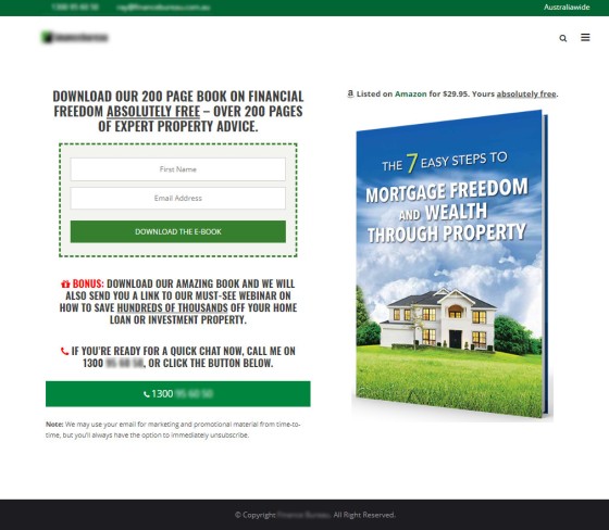
The purpose of a landing page is clear: a conversion, with an immediate phone call preferred. So, let's have a look at a very basic landing page:
Pictured: A basic landing page used by a client in 2017 (we haven't updated screenshots). The broker was a member of an AFG sub-aggregator that provided a few lead magnets, none that were particularly good, but the primary PDF offer was listed on Amazon which assigned real-life value to the download... and the book was far more comprehensive than those offensive 5-page reports that reveal less 'new' information than even a bad website.
Lead Magnet | Offer: Yabber provide a few white-label lead magnets, but it's always best to share something that a user won't find elsewhere. One lead magnet we've used in the last few months talks about how risk and rates are applied, and what might be necessary to qualify for lower rate or a larger rebate (not an ideal topic, we know, but the idea is that we attract everyone that's confused by the messy industry communication... it's followed up by the standard debt-minimisation messaging). We introduced this 27-page booklet to a managed client (full of graphs and product links) to mitigate the damage introduced by the leadgen crowd, and the results were excellent, with some regions returning leads for around $1.50, and conversions for about $12 (a reasonable conversion given the wide net applied to the offer). The entire funnel itself wasn't overly different to what we're introducing on this page.
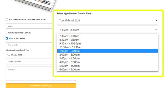
If you're going to show a calendar subscription on an entry landing page (and we 'should'), it must be a user option, meaning that we want it hidden until explicitly exposed.
Pictured: First and foremost, it should be noted that the calendar option integrated into every single subscription form is shown on every single page (every single page is a type of landing page). Selecting the checkbox shows the calendar options. Selecting a date returns available times, as sourced from Microsoft Outlook. An option exists for 'Earliest Convenience', which becomes a phone-only  subscription.
One of four interactions will now take place, and we'll handle all of them very differently.
- Bounce. No subscription.
- Subscriber. A basic value-based subscriber. Downloads the lead magnet.
- Phone Number. User provides a phone number only.
- Calendar Booking. User makes a calendar booking (integrated with Outlook).
The funnel journey has started at this point.
Since the funnel is a journey, we need to craft out immediate experiences for each of the listed groups. From this point forward, our focus should be on maintaining the attention of our user, and relevance is key in ensuring we maintain funnel momentum.
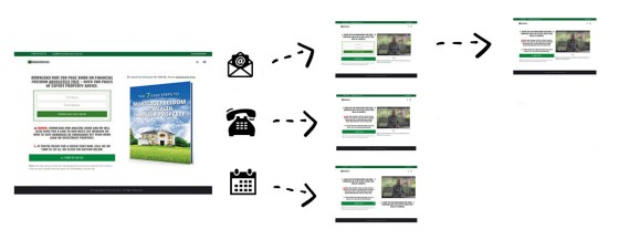
From this very first interaction, we'll direct the user in the direction of a resource that is most suitable (we'll come back to the bounce in a moment). This custom pathway is actioned by way of a Conditional Redirection, and the form redirection will send the user to an appropriate second page based on the first page interaction (the second page is an extremely high-value conversion page).
Pictured: The Conditional Redirection ensure that the second page escalates the user appropriately based on the type of form interaction. The second page shouldn't be a 'thank you' page - this is a wasted opportunity. The second page, or the page shown after any subscription, is a gift to a business that values its marketing. We know that each page view or keystroke objectively decreases conversions, and this means we're obligated to minimise the effort required to submit a single form, and we're required to show relevant content. What we've just described is a mechanism that allows us to achieve in two pages what takes others 5 or more pages... and we're on the second page, so we still have the attention of our user. The landing page a user is redirected can be a single defined page, or a split group (we don't call split-testing A/B Testing as we allow for unlimited pages to be tested against each other). Summary: A Conditional Redirection is enabled to way of an integrated calendar, and redirections are applied based on the type of interaction.
The user is now a willing participant in our funnel journey.
Before we continue, it's worth pointing out a few website actions that take shape on the basis of this form submission.
- Escalation. The same form the user subscribed to on our landing page may be the same page shown on the front page of our website. We don't want to show users the same form again - this is completely contrary to our commitment to an escalating relevance-based experience. Form and panel escalation allows to to sequence a number of forms that will show after a user subscribes to each form... and the form they've just subscribed to won't be shown again . Form and Panel escalation is a small but effective component of the broader conditional system, and it demonstrates, in part, the value of website integration.
- Conditional Understanding. First, we've resolved a lot about a user even before a user subscribes to any experience, we make available. However, a subscription ties a user to a history, and their declaration of interest immediately allows us to 'reasonably' guess their borrowing objective without trying to resolve interactions (if a user downloads a FHB guide we'll assume from this point forward - until proven otherwise - that they're a FHB). At this point, we may potentially apply conditional content to defined blocks on our website (assuming they was created). At the very least, we're able to alter the front page assets to focus on the borrowing objective of the user (in some cases, such as subscriptions on the tail end of medico campaigns, we might even Switch out the front page of our website entirely with another). A basic conditional feature allows us to show details to those that have a pending appointment.
The First and Second Email (and SMS): The first email, carrying a link to the resource made available via your landing page, and the second email, introducing the nature and value of your follow-up, are very important. Your email marketing is managed via a unique system integrated with Microsoft 365 systems (complete email marketing ownership is delivered via an application we build for your company, and the entire system is designed around compliance obligations), and the email marketing module itself provides an enterprise-level experience. The compliant SMS marketing system is via an application built with Telstra in your company name. Ownership of the funnel experience is entirely yours.
Before we talk about the extremely important second page, we'll touch briefly on the 'bounce' - categorised by a user trying to vacate the page before they've subscribed. We work hard at attracting user to our website, so we don't want to let them bounce.
Your website includes the most comprehensive and powerful 'popup' modal features in the industry. We may serve entry and exit modals on the basis of geography, lenders, resolved interest, or a specific page (and more), and its the Page Exit Modal that we'll employ on a landing page. A Page Modal is assigned to a specific page and will not show anywhere else. A very specific exit modal will be created for those cases where a user moves their mouse off screen or navigates to the back button. The modal should make an attempt to escalate the user by assigning further value to our offer, or it might give a link to our PDF-based Fact Find report which is normally reserved for the second page. The idea is that we need to introduce additional relevance and value - we can't let them escape.
Modal Statistics: The Exit Modal will objectively improve conversions. Unlike every other modal experience provided to the industry, every single Yabber modal that is ever shown is fully tracked, and individual links within modals carry modal identifiers so we're able to identify the source. Popup modals are generally an 'offensive' feature, so they're only used when relevance is maintained.
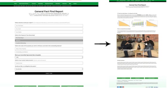
We'll assume that a user has subscribed to our offer, and we're ready to serve the extremely important second page. As stated, the second page is part of an experience we call an escalation of commitment. Rather than an objectionable upsell, we're looking to add additional complimentary value, and the optional fact find form (or anything else that adds clear, relevant value). Unlike the ridiculous 60-second quizzes you're familiar with, your website fact find is designed to qualify you, and it does this by sending a PDF report to the user upon completion. The PDF report includes some basic information, LVR/LMI information resolved from the questions, and it includes a large number of graphs.
Fact Find Funnel: Because the fact find is a genuinely engaging experience that results in actual results to the page, and sends a PDF via email, it is sometimes appropriate to use the form on the initial landing page, although the advert needs to provide clear value and speak to the relevance of the experience, and we should still send a download offer for further value. Remember, your fact find includes an optional calendar contact option ("Would You Like to Make a Booking"), so we're not forcing a second page for the sole purpose of contact (most of your competitors will show a form, they won't show any results, and then force contact details for the purpose of contact).
A video is usually included as part of the second page, with a tailored video shown for each of our subscriber types - subscriber, phone, or calendar. The video will be specific and entirely relevant to the forked funnel experience they're now riding. In the case of subscribers, or those that didn't initiate a contact of any kind, we'll show the calendar again - this time opened - and we'll invite them for a complimentary discussion. A very specific video introducing the value of the conversation massively improves conversions. If the subscriber funnel doesn't show the fact find on page 2, it will certainly show it on page 3.
Pictured: The Fact Find is a standard conditional form that asks various questions, with each 'next' question asked on the basis of each response (salary-related answers are always optional and may be removed). The reason a user is more willing to engage with the experience is because they'll receive a PDF report, and unlike the shonky experiences in the market, we'll returns information back to the user (based on rates that are available via your listed accreditations) immediately after submitting the form (it's 'kind of' a second page, except results are returned on-screen as an Ajax response). The Fact Find itself includes an Outlook-integrated calendar booking form. The inclusion of this form will only show if no booking is made, but it's an essential inclusion whenever the fact find is shown as it completely negates the need to send the user to yet another page. The concept of Triggers are introduced shortly in brief. Since each PDF report is dynamically created for an individual user, the links in each report may be tracked to the user level, and optional triggers may be applied for links clicked in the report.
At this point in our subscription funnel we've achieved in two pages what your competitors can't do in five pages... and you've presented the experience with far more authority. We know that each page view objectively decreases conversions, yet we've managed to return an entirely relevant experience very early in the sequence, with continued engagement limited only be the enthusiasm of your user, or the quality of the material you share.
Three pages is normally the limit for a landing page sequence simply because we've already offered overwhelming value, but it's not uncommon in some cases to extend the reach of the excursion to four page, with each page that offers a subscription conditionally redirecting the user into a relevant and siloed experience (you can see how it can become difficult to manage deep subscription funnels... so it's normally a good idea to leave the funnel pressure to your scheduled follow-up).
Various automation will apply when a user subscribes to any form, or any style of fact find. The user (and optionally, the broker) will be sent a text message, with the message once again tailored based on the type of contact. The user may be added to CRM systems, they'll be subscribed to an appropriate email list and autoresponder sequence. There's around 35 points of automation that may be applied, with some of the features reserved for when your marketing matures (for example, the user is added to a Facebook lookalike list).
Then The Funnel Excursion Starts...
What we've described above is the most basic top-of-funnel subscription. Those that navigate into the funnel are subjected to an ongoing experience, and it's here where you're given freedom to introduce education and edutainment in a format and manner that'll clearly qualify you as the broker of choice. The follow-up is actioned via email, SMS, and other means. We're completely upfront in an initial email about the fact that we'll be delivering some information to assist the individual achieve a better understanding of their borrowing, and it'll be you that provides the most compelling hand-holding experience (the user will research other brokers, and you're in direct competition with them ).
If the purpose of a nested funnel is used to build trust and edutainment (and it is), then we should be using assets that accelerate this process, so video should be used when able in company with standard website content.
An integrated website wouldn't mean anything if we couldn't respond specifically to the actions a user took in a funnel. Very briefly, various nested options apply:
- Page Campaign Video. When we send a user to a specific page, post, FAQ, or elsewhere, we want the journey to be connected to the funnel. We may optionally show a video at the top of the page when that user arrives via a specific campaign. The video can be personalised to the experience in a way that guides the user into an appropriate journey.
- Triggers. Triggers are automated processes that take place when the user does 'something', such as viewing an email, clicking on an email link, viewing a particular page, watching a portion of a video, or clicking on an internal website link (the list of triggers is extensive). Triggers are used to shape the funnel in a way that maximises relevance and improves the likelihood of a conversion. For example, if the user declares via an action, or via continued page views, that they have bad credit, or perhaps they don't have a deposit, we can subscribe them to an entirely new journey that is shaped around that borrowing condition. Triggers may even be applied to modal links, video view links/modals, and even simple tooltip text - it's an amazing module that was designed to support very advanced campaigns. Triggers will literally explode your conversions.
- Font Page Assets. As mentioned earlier, the primary front page assets may be altered to be consistent with the borrowing objective of a user. For example, if the know that the user is a FHB, we can start to show that information on the front page of our website. A 'Switch' module is made available that switches out your front page for another (for that specific user).
- Conditional Content. Referenced a few times in this article, and not unlike the front page changes, content on other areas of your website can be altered to specifically render relevant information. Conditional content is a big topic.
The follow-up funnel can be as advanced or as basic as you want it to be. You won't use all the features above, but it's nice to know that they're there when you need them, or when your marketing matures to a point where you can justify the time.
More important than the funnel tech is the value of the material you provide within the funnel journey. The more education you provide, the more clients you'll convert.
The Venus Report: It shouldn't need to be said (again) that the funnel is used to qualify you. To that end, an option in the funnel might be a Venus Report. A Venus Report is similar to a Fact Find with the exception that it returns 17 questions, with a PDF report (once again) returned to the user on completion. This type of communication will work more effectively than any style of sales pitch. Not unlike the Fact Find, individual links in a PDF are created for each individual user, meaning that they may be tracked, and optional triggers may be applied. This feature supports slightly more advanced escalation of commitment strategies.
Funnels are Everywhere: Funnels are obviously a core and intrinsic consideration on your website... but they're applied online and offline in different ways. For example, when sending the common RBA email you'll often link to the Monetary Policy media statement. Why send them to the RBA website when you can send the user to your own website and capitalise on the experience, and perhaps escalate those that follow your link? Of course you would prefer users visit your own website, so we created the RBA archive on your website. The video, offer, and in-post messaging on this policy statement page has to capacity to promote your core messaging and assist with creating contact with existing or new clients. This style of communication repeats itself in dozens of different ways.
We track every single interaction a user engages with in your funnel. This includes page views, links, email opens, email links, modal links, tooltips, video modals, form submissions, and so on... and all these interactions are used to resolve higher-performing pathways (we obviously need to know what's working for us). All user information (resolved via what we call the BMUID, or an ID that is assigned to a user regardless of what computer they're using, or what email they use on your system) is fed into Yabber for the assignment of a user temperature, with the temperature indicating how far every single website user might be from a conversion. It's a complex system, so what you might choose to review is simply the temperature graphs in order to gain an appreciation of general funnel activity.
The mortgage broker website framework was created to support funnel campaigns of various types, since nobody in the finance industry had ever provided an experience of any kind that came close to supporting a funnel-focused architecture. You will not provide a compelling digital experience unless your website is a trove of resources and information.
Conclusion
Despite the simplicity of what we've just detailed, the sequence is far more effective than what your competition are using. There's little doubt you've subscribed to a competitor in the past for one reason or another, and what we've just shown you is vastly different to the experience you were exposed to. Remember, the entire funnel experience is designed to qualify you - not the client, so your funnel needs to be the type of immersive and engaging experience that continually exposes your expertise and authoritativeness, and we need to provide the type of gamification that introduces trust into the excursion.
When a user lands on your website for any reason, we're required to craft out a website pathway. A website pathway is a website funnel that is designed to escalate and convert, and your website should be designed in such a way that site navigation is a function of design - not choice. The broker website architecture that we've build seeks to create these conversions, and the framework is introduced in an article simply titled "Mortgage Broker Website Framework". Towards the bottom of the linked article, you'll find a number of links to articles that further articulates how funnel pressure is applied, and how you may craft out specific experiences for individual website visitors.
Digital funnels are an absolute necessity for your business, and your website itself needs to support the nested experience to educate and inform those that are researching various topics. If you don't have crafted funnels in your finance business, you simply don't have a functional digital mortgage business.


