In previous articles we introduced landing panels, and how their use on every available page of your mortgage broker website  explodes your conversions. We also described how user engagement with the panels provides a conditional understanding of our website visitor, thus allowing us to shape their conditional experience - the foundation of a website funnel. This article introduces a simplified variation on the panel theme: the simple panel.
If you're unfamiliar with the 'Panel' concept, the Landing Panel is simply a side-by-side form with a basic subscription form  and lead magnet image or video. Various attributes of any landing page may be included in the 'any-page' subscription panel, such as text above the form, below the form, and so on. As with every form made available in Yabber
  - our digital marketing and social media platform - you may employ the use of conditional redirections to an appropriate second page based on the form interaction, and each form inherits an escalation cycle so we don't show the same form or lead magnet more than once (this behaviour is part of our website funnel escalation of commitment journey).
The 'problem' with the panels as they previously applied is that we found their use to be a little 'advanced' for the average user. Most business owners didn't ask for an alternate experience, necessarily, but it became clear that we needed another style of panel to force best practice, and one that makes the creation of panels an even easier and more pleasurable experience. It's for this reason we've introduced the Simple Panel.
The Simple Panel
The simple panel is almost identical to the Landing Panel in every respect except for the fact that we always render just two primary components: the subscription form and the lead magnet (this includes form-specific elements, such as borders, text above the form, and text below the form - so anything 'form' related). The conditional escalation and form-based escalation mechanics continue to apply, but there really are no other options.
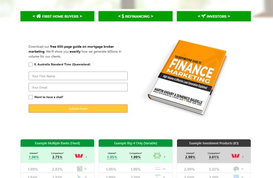
Pictured: The Simple Panel includes a subscription form (with back-end automation automatically applied) and a lead magnet. The form includes an integrated calendar (usually hidden behind a checkbox) that fully integrates with Outlook. The automation that applies to each subscription includes email autoresponder programs, segregated subscriptions, SMS messaging, CRM integration, Microsoft Task and Planner integration, and so on. As we'll come to describe, the forms are automatically rendered in defined locations, and they can be used anywhere else via a 2-second drag-and-drop option. Again, as we'll describe shortly, this top-of-funnel (or mid-funnel) subscription opportunity should exist on every single page. The simple vertical forms are also applied wherever we can squeeze them in, such as under blog posts. Every page on your website is a potential organic entry point, therefore every single page on your website is a type of landing page. In the pictured example (an actual page from our demo mortgage broker website) you will note the drag-and-drop and fully-customisable bank widgets under the lead magnet - an essential component of any broker website.
The panel was designed to be suitable for the large majority of your panel-based subscription requirements, and as such, it has becomes the panel we use on Yabber when defining what form is used on specific pages (since every page must include a subscription and offer). The Panel is easy to use, and it is for this reason the Simple Panel subscription tool is what we generally recommend in almost all cases where a two-column form is required. The more advanced panels are still available but the 'perceived complexity' may possibly interfere with your agile workflows.
Creating Simple Panels
Creating simple panels is, as the name implies, rather simple. First, and just to complicate life before we introduce the simplest method of creating the panel, you may still create a simple panel on the basis of landing page attributes (just the form and lead magnet). So, anytime you create a landing page you're also creating a landing panel (the panel simply inherits those two fundamental form and magnet features).
The Simple Panel is a standalone panel without the noise... meaning that the only options are the subscription form and lead magnet. At this point we're hoping you're not confused - it really is super-simple. The end result is something simple, elegant, and extremely functional.
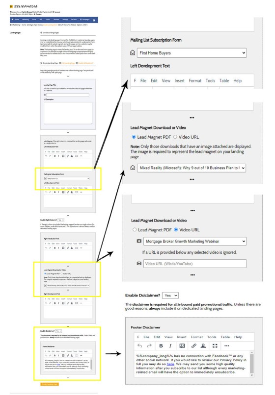
The following is a page that we use for creating integrated landing pages (where all panels used to inherit their features):
Pictured: Landing Page Creation. Most of the elements are selected via simple menus. Optional text applies that wrap around the page. The one-click and other types of landing page creation is discussed in an article titled "Powerful One-Click Landing Page Creation".
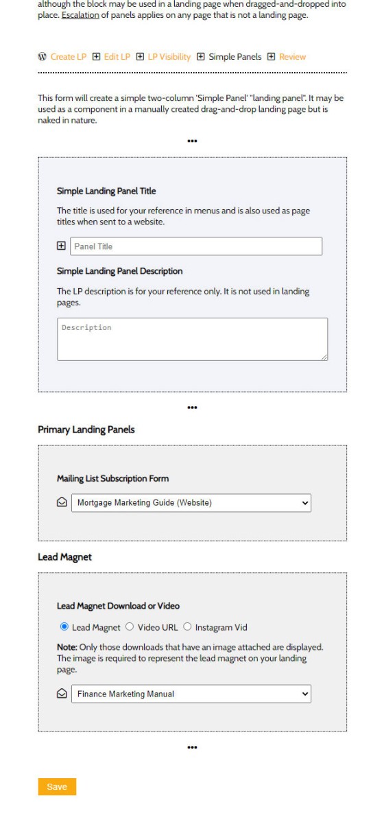
The fields available when creating a landing page are reasonably extensive because we're dealing with multiple attributes that might be applied, such as various headings, general text locations, footer text, and disclaimers. None of this is necessary for a landing panel so we eliminate what we don't need and only show what is required. The result is a form that presents as follows:
Pictured: Simple Panel Creation. Simply select a subscription form and the associated lead magnet. When saved the data is sent to your website and immediately made available as a drag-and-drop option, an assigned option, or with shortcode.
The form is very simple, and very easy to create.
We use the Simple Panels everywhere.
The Panels Convert
As we've mentioned multiple times on this website, every page on your website is a potential organic entry point - traffic can come from anywhere. As such, every page of your website must emulate the standard objective of a landing page and provide a subscription and lead magnet.
We present clean pages with enormous amounts of 'packaged' information (by way of FAQ creation), and the 'cleanliness' is maintained because your website funnel requires clear funnel-based navigation pathways, and a subscription opportunity that inherits early above-the-fold attention. It's the Simple Panel that provides a very clear top-of-funnel entry point into your escalated experience.
In an article titled "Defining Website Form Locations – Explode Your Conversions" we show you the one-click mechanism to assign Simple Panels and standard (vertical) subscription forms wherever they're required (which is everywhere).
Panel Automation and Escalation
Part of our website funnel ideology, and our broader marketing funnel philosophy, is predicated on an escalation of commitment. This means that once a user subscribes to a form we won't show them that form again. Instead, we'll show the next form in a defined list in order to escalate that user and funnel them deeper into our experience. Escalating forms are part of the 'Conditional' experience wrapped around our website methodology.
The forms assigned to landing panels are introduced in an article titled "Creating Email Subscription Forms in the Yabber Marketing Platform". All the extensive automation applied to Simple Panel is inherited from the form used.
Every form created on Yabber may optionally have Conditional Redirections applied. The conditional redirection creates an immediate escalation opportunity within your funnel after early lead capture based on form interaction, and further improves upon your lead conversions (the top-of-funnel is to get a user into your experience - not to qualify... and the second page should be used for escalation).
Simple Panel Elementor Block
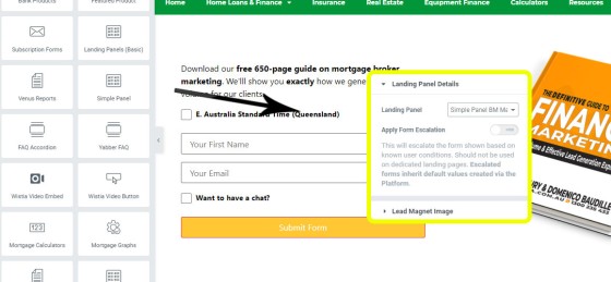
The Simple Panel is positioned onto your page via the drag-and-drop Elementor block, or optionally via shortcode. You drag the Simple Panel block into position on your page, select a Panel, and you're done - the form renders immediately, and all automation is immediately applied. You may optionally cycle the escalation on and off although we'd generally recommend it always be applied (the only time escalation is forced off is on any page within the landing page category).
Pictured: The drag-and-drop block to position Simple Panels onto your page. Another block exists for 'location-based' blocks. Once dropped into position you simply select a Simple Panel and you're done.
The only additional option that applies with Simple Panels is the ability to alter the lead magnet image (rarely necessary).
The article introducing location-specific Simple Panels, and the associated Elementor block, is introduced is introduced in an article titled "Defining Website Form Locations – Explode Your Conversions".
Your Website is Vital
The single most significant failure of the digital industry is preaching that the promoted top-of-funnel entry point, such as Facebook Marketing, is in any way disconnected from your website funnel - they're intrinsically connected... and you can't have a truly successful paid campaign of any type with a website that doesn't integrate with the promoted journey - period.
Your landing pages shouldn't just reside on your website domain, but they must be fully integrated (this means the data belongs to you, and the engagement shapes the funnel journey). What this means is that if your digital representation has ever introduced you to Lead Pages, Click Funnels, High Level (in particular), or others, then your overall experience is seriously compromised and your returns will suffer as a result. If any marketing representation has ever introduced you to these services, or they have failed to optimised your website funnel before embarking on paid campaigns (or any campaign), then their service has objectively failed you. The notion that you will send paid traffic to somebody else's website when you have the capacity to host that page yourself - and profit from the engagement - is utterly absurd. The idea that conversions are something that is reserved for only paid promotion is another ridiculous proposition; digital works around the clock to attract, nurture, and convert traffic if you permit it, and only if you have a suitable digital framework in place.
Sadly, the finance industry has attracted crowds of people making self-serving noise that tends to dilute the value of higher-performing experiences. We've even seen some
As the landing panel demonstrates, the opportunity for a user that ingests them into a secondary funnel alone turns your website into a conversion machine (the primary funnel objective is to escalate a website visitor into a real world funnel) . Of course, there are other elements that craft a website funnel experience, but it's the every-page conversion that returns more immediate results, and it's the one tool you will start using the very first day you use your new website. Other tools are drip-fed into your marketing program as your marketing matures, or as they're required.
Conclusion
The conduit between your website or landing pages, and your business pipelines, is your subscription form... so it has to be good, and it has to be everywhere. Simply put, without the offer in the face of your website visitor they won't engage with your digital assets, and they certainly won't go looking for it.
The website funnel is designed to escalate a user into another funnel - either a real world experience or a digital funnel journey. Either way, the entry into that experience has to be made easy, and it's the Simple Panel that serves as the perfect mechanism to facilitate the transaction.
If you're one of those that claims your website doesn't convert, it's likely because there were no mechanism in place that enabled your website to convert. The mortgage broker website we provide our finance clients is designed to support the website funnel methodology in amazing ways making it far more powerful than any competing product in the market.


