In the days before we integrated multi-website management within the Yabber  platform we would have business owners call us all routinely for very basic website tasks that really weren't difficult to make. Something as simply as changing social links, or the logo in your footer, is often outsourced to a website team that'll apply a minimum 'first hour' fee for their efforts when the actual work might have taken less than 30 seconds to complete. In this article we'll introduce the option to not only change various front page assets (such as text and video), but also how we've created a fully-integrated and extremely simple point-and-click features that'll add a million-dollar, enterprise-level, and conditional experience into the industry's most affordable website.
Yabber's front page module is intended to make it extremely easy for you to control how the front page of your website is presented, and it permits you to make the conditional changes in seconds. This conditional feature permits you to serve different content to different groups of users based on their website funnel browsing habits, past interactions, and known funnel pathways.
The morphing features of your website apply anywhere - not just the front page - and they're designed to do one thing: attract more conversions into your pipeline.
It should be noted that many won't need or use the features described in this article. However, when the features become necessary, or as your marketing requirements grow, it's nice knowing that your website will do whatever is required of it.
The 150+ page mortgage brokers website we provide clients, and all the extremely powerful features made available within Yabber  , is still provided for a fee lower than the typical 10-page static sites served to the market, and we'd argue it's 100X more powerful... and it's still the only website designed in the industry designed to fully support Facebook marketing and other paid promotion.
Primary Front Page Features
The front-page features below are those that we consider essential entry page assets, with the results determined by analysing millions of page views.
- Call to Action Text on Entry
- CTA Button (Link or Video Modal)
- Entry page lead magnet panel (offer and subscription)
- Front page primary video
- Primary video panel
- Text above front page blog articles
- Live Bank Product Widgets
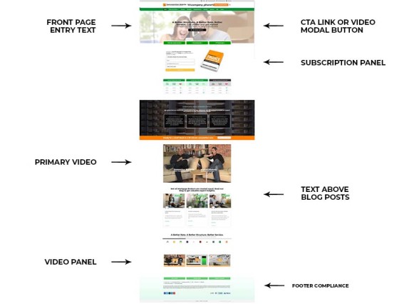
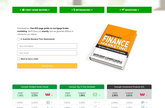
The page shown below indicating the default position of various resources doesn't necessarily represent what your final page will look like, but it does show those front-page assets that are essential, and those that inherit interest-based conditionality by default.
Pictured: Pictured is a typical and generic entry page. The six conditional marketing assets tend to cover the entire page, and they change based on identified browsing habits (or on entry back to a website after browsing various pages). It's a simple conditional model but is highly effective when used correctly. As with any website front page, we only serve content that serves a conversion purpose. Anything that detracts from any primary conversion objective will diminish conversions.
The landing panel is the single asset that will convert most often on your front page (in addition your phone number), and it's the live bank product data or clearly defined and easy to find navigation that is the starting point for a website funnel journey. Any link click or page-view from this point forward feeds us with an understanding of what our client is looking to achieve, and we can introduce a shape-changing experience gained from this understanding.
Creating or altering your front page content is a quick and effortless process. As with the entire Yabber system, we've tried to make changes something you can action yourself in seconds without having to log into your website administration dashboard.
Making Front Page Content Changes
Navigating via Yabber's Website menu to 'Site Management', and then 'Front Page', returns the basic panel for defining what assets or text is shown on your front page. The first step in each case is to select the relevant website, then select the appropriate interest type (we'll come back to this in a moment), and then define the content that needs to be shown. An example of a panel that determines the text shown on the entry screen (over the entry image) is shown below.
Pictured: Website entry text. The text is made up of a primary title and subtitle, with a bold and normal font type for each. This panel may be replaced with a video or alternate CTA-style block, such as a subscription form. Whatever asset is used in the always-important top-half of your primary entry page, it should be made clear that you're a mortgage broker. No fluffy messages, please.
The front page CTA text is made of of two sentences, with each sentences defined by two style types. It's typical for the first three options to be used.
Pictured: Website entry message. Your page won't look like this; you may want to increase the size of the image, or align text to the left, or even change the boring picture. The text, however, is based on the interest text defined in Yabber.
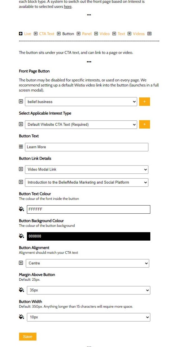
The call-to-action button is optional but one that we'd highly recommend. You may select a video or link option, with the former launching a full-screen video modal, while the latter option simply returns a link to another page.
Pictured: The optional CTA button. The early link is designed to give focus to a featured video introducing your business and services, with a very clear call-to-action. The video should normally be a Wistia video so all stats are recorded in Yabber (Wistia permits three free videos by default).
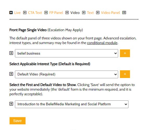
The essential front page primary video normally shown towards the middle of your page is managed in the same way.
Pictured: The entry page video - a vital component for any website. Note that the video is selected by way of a select menu - we don't want you wasting your time copying and pasting embed code. The select menu shown videos from YouTube and Wistia, with the latter hosting provider permitting three video videos with their free account.
Other front page features are managed in the manner described above.
The Lowest Rate Placeholders
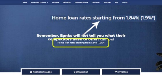
In the case of the entry text, button text, and the text above your blog posts, using the placeholder of %%rate%% and %%comparison_rate%% will return the lowest paired rate and comparison rate available via your panel of lenders. The rates are cached for a short time, but your lowest available rate will always be shown.
Pictured: Usage of the product rate on a broker website. We've seen brokers update this data themselves as rates change, or as the lowest rate made available via their panel of lenders change - the feature should be automated. The inclusion of rate data obviously makes a difference to those consumers that are driven or motivated by interest rate.
The rate is typically shown in the second line of the primary CTA text, with a line stating something akin to "Rates from %%rate%% (%%comparison_rate%%). Up to $4000 cashback from selected lenders". The comparison asterisk pointing to your on-page footer and disclaimer is automatically applied.
Your Website is the Chameleon of the Website World
The mortgage broker website we provide our clients is infinitely more powerful than the generic nonsense peddled to the market. Part of this power comes from the conditional content features that literally explodes your conversions. As described, the conditional content features (a core component of our escalation-based ideology and methodology) will alter the front page (and other pages) based on the determined interest type of your user.
If a user is interested in their first home, and we're able to resolve that borrowing objective, we'll show them First Home Buyer information, and if a website visitor is an investor we'll render that content instead. As long as we're able to determine the type of user navigating your website we'll serve them with information that is more likely to engage and convert... and it really does explode your conversions. We've seen the most significant improvement in conversions based on altering video content and landing panels, so if you're going to alter just two of the primary front-page assets we've found that they're the two that have the most significant impact.
In the case of the Simple Panel shown on the front page, it will escalate itself based on previous interactions, so if a user subscribes to that asset we'll vertically cycle through a number of other forms in a defined sequence. The methodology described underpins our website experience and it is designed to do something that no other website made available to the mortgage industry will do: convert.
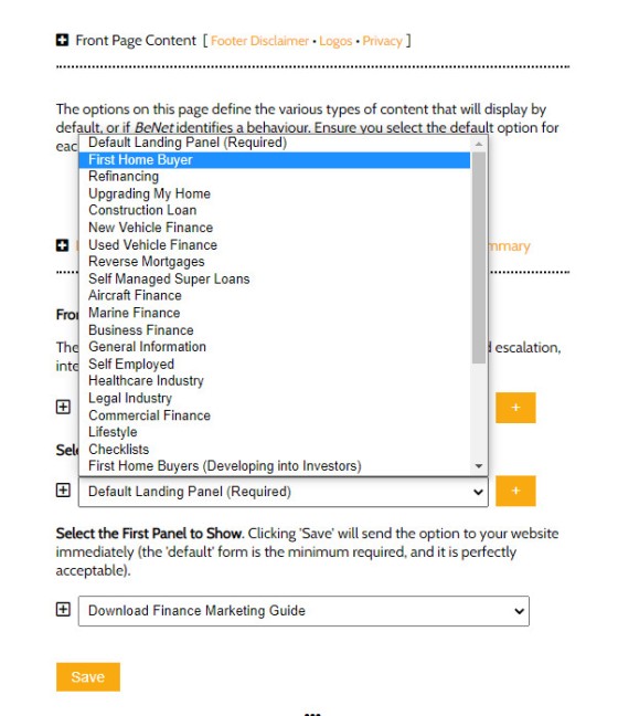
Pictured: The landing panel form, showing the interest types that can be assigned to the subscription. The interest types are defined by you. The interest is determined by browsing habits, and backed by the only AI in the finance marketing space - BeNet.
Pictured: The front page Simple Panel subscription form takes on two forms of primary conditional escalation. First, we serve a landing panel based on the interest type of the user (if resolved, otherwise the default), and then the same form takes on a vertical escalation cycle; once a user subscribes to a form they aren't shown the same form again - at least until the escalation cycle is complete. The three-dimensional escalation always ensures we're showing the content most likely to convert a cold website funnel participant into a warmer and crafted marketing funnel.
As we've stressed a number of times before, we create a pathway into a booking with the least amount of work by including an integrated calendar subscription panel on every single page. Used in company with conditional redirections you can, once again, start to appreciate the how a high-converting website works.
A conditional experience crafts the experience your website visitor is looking for instead of the generic and flat experience normally rendered by default.
Your Marketing Is Advanced As You Need It To Be
The conditional front page feature we've just described - and indeed the broader conditional features build into our broker websitee - are optional. You only need one message to show on the front page of your website. The point is that as your marketing matures, or you find a need to improve in certain areas, your website will support whatever requirement you throw at it.
When you start to consider how general conditional content might work alongside other conditional features, such as conditional redirections, and escalating subscription panels, it starts to become a little more evident how the simple changes can start to shape the journey any user might take on your website.
Conclusion
We haven't introduced all the front-page features (far from it, in fact), but we have given you an indication of how easy it is to manage the resources on your most trafficked page.
While your front page is super-important, every single page on your website is a potential organic entry point. As such, every page needs to have integrated functionality to drive a user into or deeper into your marketing funnel.
Never let it be said that a website doesn't attract and convert traffic, and never ever listen to those self-serving and seriously flawed messages from the industry charlatans telling you that your website isn't necessary. Those competing industry messages are crafted by the bottom-of-the-barrel representation designed to assign value to their 'other' poor-performing programs. Your website is the center of your marketing universe, an absolutely essential ingredient for highly successful Facebook and other campaigns, and a vital component of your marketing funnel.
Once again, It's important to note that our mortgage broker website is priced lower than virtually all competing products in the market, it is driven by in-house technology, and supports programs - such as your Facebook marketing - in a manner that vastly outperforms anything in the market.


