Commbank branding has seen two significant redesigns in its history.
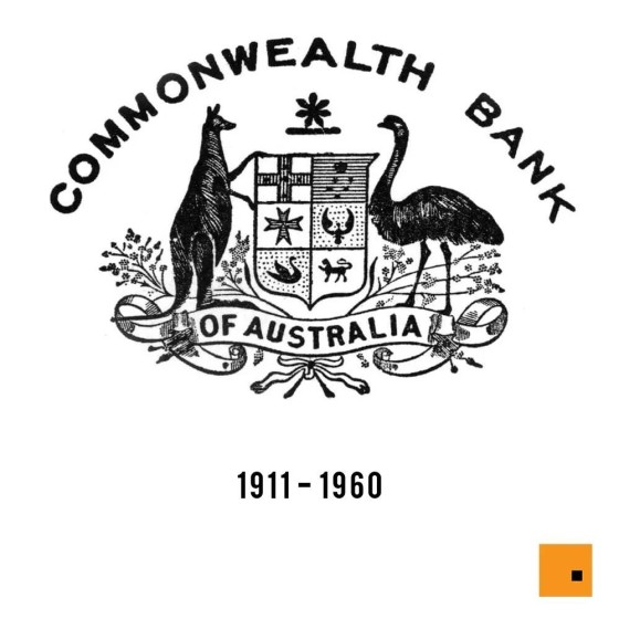
The first logo - introduced in 1911, and used when the bank started operations in 1912 - depicted the bank's name, as well as a modified Australian coat of arms; - it was, after all, a Government facility. The logo features a shield, and kangaroo and an emu standing either side. The shield was slightly elongated, and the pictures in it were rearranged slightly.
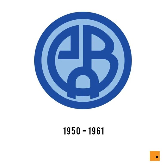
The logo of the bank from the 1959s was composed of a bright rounded badge, executed in two shades of blue " a lighter one for the background, and a darker for a stylized monogram, consisting of "CBA" lettering. The badge was outlined in the thick frame in the same shade of blue, which was used for the monogram.
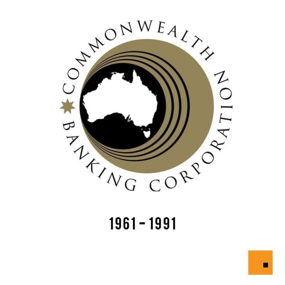
The 1961 logo was a stylish circular image with a thin black wordmark around it. The emblem featured a beige background with a bold black circle on the left side. The circle was outlined in three thin black circular frames and had a white contour of the Australia continent placed in the middle. The lettering was executed in a serif typeface, and all capital letters of the inscription have significant lateral space, which added lightness and style. A beige seven-pointed Star was placed on the left from the emblem, pointing at the beginning and the end of the wordmark.
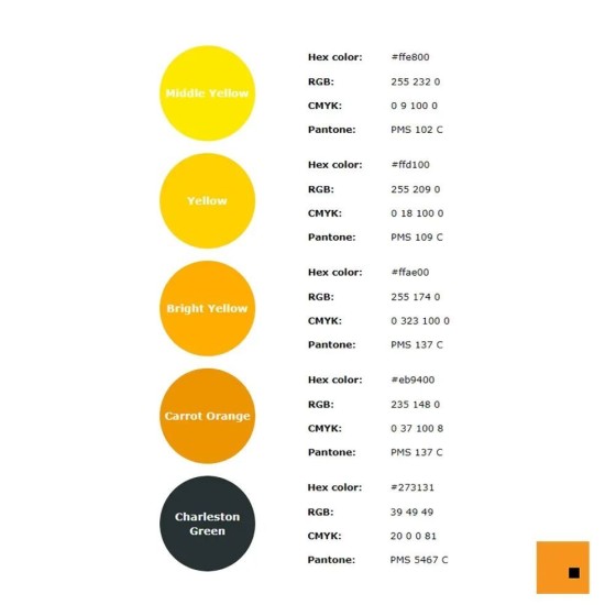
The redesign of 1991 brought a new and modern concept and colour palette to the bank's visual identity and brand. The new emblem features a yellow and black palette and comprises a solid yellow rhombus, with a delicate geometric fragment in black along its right side. The wordmark in black is placed under the emblem and executed in two wrights of one sans-serif typeface.
The 2020 logo has the same rhombus, but the black section turned a shadowed yellow. The wordmark was also removed.


