Scrollable is a content tool we've introduced as part of our 'Blocks' module, and downline to Yabber's parent Contentus module. Scrollable simply allows you to include blocks of content in a scrollable window for those cases where you choose to contain large amounts of text in a smaller contained area. An option to render a checkbox that, when checked, immediately redirects the user to another page makes the tool suitable for those cases where you would like a user to accept terms and conditions before showing them a particular page or resource.
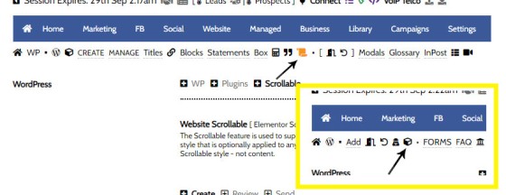
While the feature is generally an Elementor tool, the styles themselves are optionally defined in Yabber. You will find the Scrollable option by navigating to the Contentus module (via the small cube in the Website menu).
Pictured: You will find the Scrollable option by navigating to the Contentus module (via the small cube in the Website menu). You will also find Scrollable links in general Yabber menus.
The Result
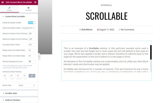
A general example is provided below with only basic options applied. The optional checkbox will redirect you back to this page (in reality you'll obviously redirect a user elsewhere). We've sued the shortcode of [scrollable c="63624" url="https://www.beliefm .. mentor"] (URL truncated for readability).
This is an example of a Scrollable window. In this particular example we've used a smaller font size and line height but in most cases the font will default to that used on your page. We've also applied a border and a redirect checkbox (it redirects back to this page but the expectation is that you'll redirect to a new page or form).
All elements of this Scrollable window are customisable, and not unlike any other Block element, media and shortcodes may be applied.
Scrollable was introduced for a number of reasons. First and foremost it's just a funky tool that's available to you, but it was also a compliance consideration. In talks with a group quite recently they indicated that they were obligated to provide an entry disclaimer whenever an online application was commenced.
The Scrollable window may be dragged into any position of your page with our Elementor block or via the use of shortcode.
The scroll handle and background may also be customised.

There is no limit to the amount of text or type of content you may render into a Scrollable block. A number of examples are shown towards the bottom of this page.
Shortcode Attributes
Should you choose to use shortcode, the following attributes apply. Note that you'll rarely if ever use them; styles are generally manufactured in Yabber and negate the need for messy attributes.
c
margin_above and margin_below
padding
height
width
height
min_height
yabber_scrollable_style
loader
white. Alternative is black.background
#ffffff.font_size
0.9em;line_height
1.1.scrollbar_color_hover
#000000.scrollbar_width
scrollbar_thumb_color
#000000.scrollbar_radius
10(px).scrollbar_track
#F3F3F5.scrollbar_track_border
#F3F3F5.scrollable_padding
padding: 12px 15px 7px 15px;'scrollable_border
border-left: 1px solid black; border-right: 1px solid black; border-top: 1px solid black; border-bottom: 1px solid black;'.checkbox_color
#ffffff.checkbox_bg
@000000.checkbox_padding
2px 15px 3px 15px;'.enable_checkbox
checkbox="1" for yes, and checkbox="0" for no.checkbox_text
url
url attribute.Yes, shortcodes are complicated. The Elementor block mitigates the complexity and makes it simple.
Scrollable Styles in Yabber
You may create styles in Yabber but content is always created on your website. the facility to create styles completely bypasses the need to mess around with shortcode attributes, meaning you simply reference a style in your shortcode and nothing else (with exception of the content, of course).
Pictured: You may create styles in Yabber but content is always created on your website. the facility to create styles completely bypasses the need to mess around with shortcode attributes, meaning you simply reference a style in your shortcode and nothing else (with exception of the content, of course). Unchecking the 'Apply a Checkbox Redirect' checkbox will hide those options.
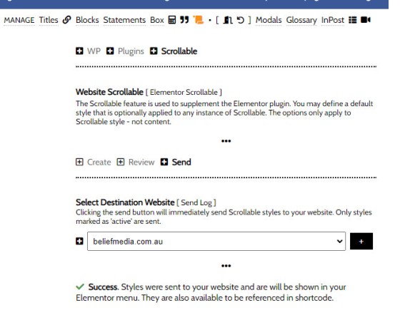
Once you have created your style or styles, you should send them to your website via the 'Send' panel.
Pictured: Once you have created your style or styles, you should send them to your website via the 'Send' panel. The styles become available in Elementor menus and WordPress shortcodes.
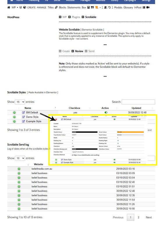
You may review and edit Scrollable styles via the 'Review' panel. Click on the edit icon to edit any style.
Pictured: You may review and edit Scrollable styles via the 'Review' panel. Click on the edit icon to edit any style. When any edit is made to a style, you should resent it to your website.
Scrollable Elementor Widget
If this FAQ has done nothing else, it has exposed you to a large number of Scrollable options - most of which can be ignored. However, when using Elementor, the style and presentation options are very easily applied. Search for 'Scrollable' in Elementor. It is normal to select a Yabber style rather than use a static style created in Elementor - this way your styles can be globally updated in Yabber.
Following are just a few screenshot examples of styled containers. Various Elementor options are shown for reference, with the last three showing the checkbox option.
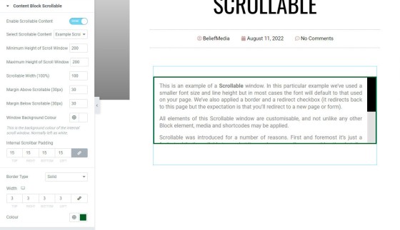
Pictured: This example shows a naked design with no styling applied (with the exception of the default style applied to the scrollbar and handle).
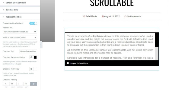
Pictured: The second example introduces a green margin and we've widened the scrollbar handle and removed the radius (curvature).
Pictured: the third option is more of a 'default' style. It includes a black border and footer, with a redirect option applied.
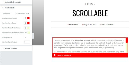
Pictured: The fourth example reintroduces the curve to the scrollbar handle, styles the border and footer in red, and we've applied a background colour to the scrollbar track. The screenshot shows how the red and light yellow colours were selected.
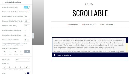
Pictured: The final example applies a background colour to the blind container. The colur of the scrollbar handle may obviously differ from the frame colour; we've applied the same only because it looks better.
The examples are styled for illustrative purposes only - they're not palettes we'd ever use.
■ ■ ■
Related Content Block FAQs
FAQs relating to use of Content Blocks.
Your website includes a very large number of methods to include different types of headings, including and (both of which serve a specific purpose), with other shortcode and Elementor tools making the addition of various 'headings' a piece of cake. While there are any number of ways to generate page titles, the 2015.3 website framework… [ Learn More ]
There are an extremely large number of tools we make available in Yabber and on your website to create and modify lists and other content blocks, and each method introduces variation on the 'global content theme' in that they present differently and are handled differently on your website. The one premise that underpins any type… [ Learn More ]
There's a large number of ways to return hidden content to your posts and pages using shortcode, and the Toggle Shortcode is simply another option you might choose to use. The feature utilises the same toggle mechanism used in the Formly (form) module. This FAQ will describe basic usage. Shortcode of returns the following: The… [ Learn More ]
In a previous FAQ we introduced to the the 'BM Box'. The 'BM Box' is a navigation and panel element that provides information in a format that was deliberately designed to emulate the general presentation of the Lender Widgets on your website. The BM Box is created in Yabber or Elementor, and a number of… [ Learn More ]
The Conditional Content Blocks arguably the more effective method of rendering blocks of conditional content. The 'Blocks' module introduced to what we're about to described, but if you're starting with Conditional Content, we'd suggest you use this module rather than Blocks simply because of the ease a single page may be assigned to a single… [ Learn More ]
Conditional Content is one of the defining features of your website framework. Despite the fact the Conditional Content blocks are often avoided because of the perceived complexity, they seriously amplify the effectiveness of any organic or promoted funnel. We appreciate that many brokers just 'want a website', and that's find, but if and when the… [ Learn More ]
The BM Box is simply a small element used for the purpose of navigation or information blocks. It is one of two primary blocks we've built, with the second being the BM Panel. The Panel is far more robust and is pending migration into the standard framework. To 'Services' page, accessible from the primary menu… [ Learn More ]
In this FAQ we introduce the very basic 'Reveal' (or 'Blind') shortcode and Elementor widget. Hidden content is revealed after a 'link' is clicked. It's a very simple but highly effective tool. The 'Reveal' tool requires familiarity with the as it is block content that is returned in the blind. The result of a basic… [ Learn More ]
Blocks are simply blocks of content of any type that may be recycled in multiple locations on your website. When they require an update, a single block only needs to be updated in Yabber to globally alter all occurrences of that block on your website. Block content is easy to create, easy to modify, and… [ Learn More ]
Resulting from various State-level Government incentives and fees, one of the areas that differs significantly from state-to-state is the purchase of a first home. The FHB Panel is one of the simplest conditional features of any type to use because it serves content that is resolved by State - not interest, which is the typical… [ Learn More ]
Your website includes a large number of tools to group related content into an accordion-style panel - the Post Accordion is just another one of them. The feature is supported by shortcode and an Elementor block, and the style/presentation is managed in Yabber. This FAQ will show you how to use the tool. An example… [ Learn More ]
Scrollable is a content tool we've introduced as part of our '' module, and downline to Yabber's parent Contentus module. Scrollable simply allows you to include blocks of content in a scrollable window for those cases where you choose to contain large amounts of text in a smaller contained area. An option to render a… [ Learn More ]
The HTML <details> tag is a lesser-used HTML tags which often negates the need to use fancy-pants JavaScript to return 'hidden' content. Our shortcode that references this tags is a ridiculously minor feature, but since it utilises the it was worthy of inclusion. Many businesses have found use for the feature. Your website includes hundreds… [ Learn More ]


