
The BM Box is simply a small element used for the purpose of navigation or information blocks. It is one of two primary blocks we've built, with the second being the BM Panel. The Panel is far more robust and is pending migration into the standard framework.
To 'Services' page, accessible from the primary menu and above the dropdown options, illustrates how the Box is used on your website. The box is designed to emulate the default style applied to the lender widgets - this rationalised design permits you to maintain presentation consistency when rendering basic features.
Grouped BM Box Grid: This FAQ introduces the method used to return a single BM Box. To return a grid of 'grouped' boxes, review the FAQ titled "How to Create and Manage BM Box Grids".
●

Pictured: Mortgage Broker Website 'Services' page. The box is simply designed to emulate the stylistic presentation of the lender widgets. The style allows more consistency to be applied to content when it's required. In the pictured example, each of the widgets includes a linked title as white text on a black background, a basic subtitle, and description text. Each widget includes a small black border.
The Result
The BM Box can be returned with basic shortcode, and we'll render a few basic boxes below without Elementor support. When you use the box on your website, you will likely create responsive 'Inner Sections  ' or 'Sections' via another method.
The result of our first box is shown below (we've placed it in a div to be 300px in width). Shortcode of [bm_box url="url" title="title" text="Subtitle" description="Description" height="0" width="400"] returns the following:
As you can see, the box is quite basic, but it's also rather versatile. The title bar, subtitle bar, and description, will only render if text is assigned, so you could use it for a basic textbox with only description text. An icon may be applied to the title, and the title tooltip may also be personalised.
The following example shows how the Box can take on the shape of a standard textbox.
In our final example, we have applied a height of '0' which forces the height to scale to content rather than a fixed height.
Shortcode is always a little messy and difficult to remember, so the Elementor option is almost always preferred, particularly since the Box is an element added in design and rarely in post content.
BM Box Elementor Block
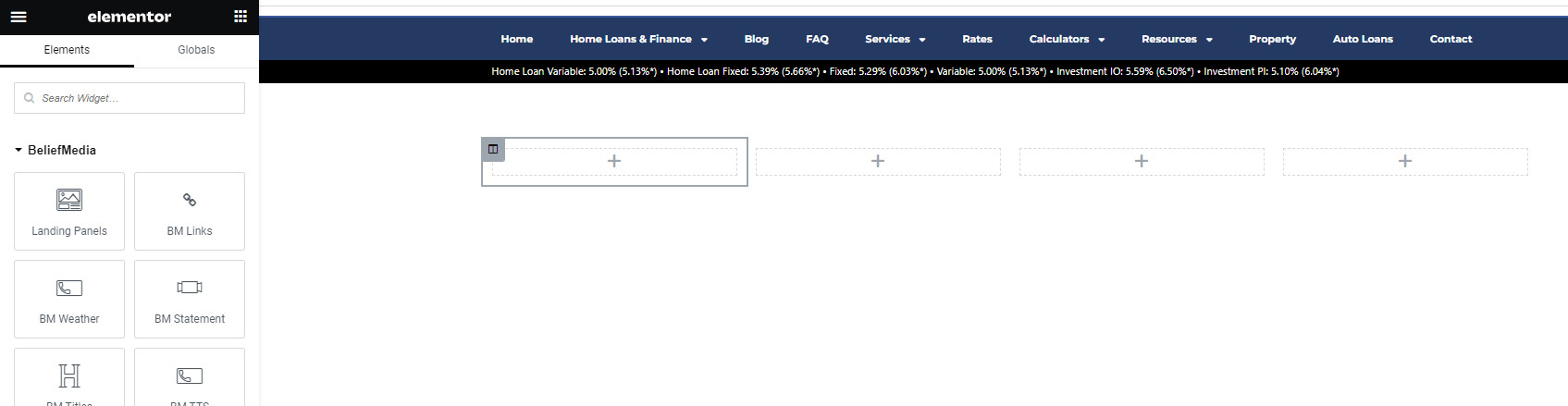
If you know what you're doing, or you're familiar with how our website tools work, you can search for 'BM Box' block in Elementor, drag the element onto your page, and define as required, and Save. Changes are made immediately.
If you're new to the BM Box, the tool does require a short introduction. The style and text shown in the box may be defined in Yabber or Elementor, with the former being a preferred option since you can use the same block in multiple locations and update globally. Further, the Yabber-defined style means that you may update any or all styles in Yabber and have the change made globally - something you can't easily do in Elementor.
So, in summary, the following three options apply for the creation of a BM Box.
- Text and Style Defined in Elementor. This is quite a poor option as the values and style is fixed.
- Text and Style Defined in Yabber. This is always the preferred option. The style and text may be altered as required to all occurrences of the BM Box. Changes may be applied to all blocks referencing the 'Default' style, or just to those referencing another style.
- Style in Yabber, Text in Elementor. This option isn't ideal since the text is fixed, but a style (perhaps the 'Default' style) may still be applied and managed globally.

Pictured: Locate the 'BM Box' block in Elementor, drag into your page, and define as required. Changes are made immediately.
Let's have a look at what the creation panel looks like when creating style and text in Yabber. Note that the toggle switch towards the top of the Elementor panel asking if you would like to 'Use Yabber Style" is on, and the toggle switch to use a Yabber text profile is off.

Pictured: A single default style is usually created in Yabber (as described shortly) and then applied to most occurrences of the BM Box. In fact, the content of the Box itself may be defined in Yabber, and this facility will also be discussed shortly. However, if you choose to use the standalone Elementor tool, the options are shown.
If we were to sensibly use a Yabber Style and Text Profile, we'd set the toggle switches accordingly, and the select menus are shown in Elementor.

Pictured: If we were to sensibly use a Yabber Style and Text Profile, we'd set the toggle switches accordingly, and the select menus are shown in Elementor.
Using a Yabber source for the Style or Text Profile requires that the details be defined in Yabber. We'll have a look at that next.
Creating Style and Text Profiles in Yabber
You will find the BM Box options in Yabber by first following the 'Contentus' icon in the 'Website' module. Select 'BM Box' from the returned submenu.

Pictured: You will find the BM Box options in Yabber by first following the 'Contentus' icon in the 'Website' module. Select 'BM Box' from the returned submenu.
You will be presented with a 'Create' panel to define text profiles, and a 'Style' panel to define style profiles. The latter essentially emulates the options in the Elementor website widget.
The Text Profile is presents as shown below.

Pictured: You will be presented with a 'Create' panel to define text profiles, and a 'Style' panel to define style profiles. The latter essentially emulates the options in the Elementor website widget.
The Style Profile is presents as shown below.

Pictured: You will be presented with a 'Create' panel to define text profiles, and a 'Style' panel to define style profiles. The latter essentially emulates the options in the Elementor website widget.
You may define as many text and style profiles as you like, but at least one style profile should be set as the default - this may be done when creating the form, or in the 'Review' panel.
Sending Updates to Your Website
When changes are made in Yabber and you're ready to send the updates to your website, you should navigate to the 'Send' panel, select your website, and Send. Updates are applied on your website immediately.

Pictured: When changes are made in Yabber and you're ready to send the updates to your website, you should navigate to the 'Send' panel, select your website, and Send. Updates are applied on your website immediately.
Review and Edit Styles
You may review and edit text profiles and style via the 'Review' panel. Select the green icon to return an accordion with profile data, and select the 'Edit' icon to edit the applicable asset.

Pictured: You may review and edit text profiles and style via the 'Review' panel. Select the green icon to return an accordion with profile data, and select the 'Edit' icon to edit the applicable asset.
A log is maintained of all changes sent to your website.
■ ■ ■
Related Content Block FAQs
FAQs relating to use of Content Blocks.
In a previous FAQ we introduced to the the 'BM Box'. The 'BM Box' is a navigation and panel element that provides information in a format that was deliberately designed to emulate the general presentation of the Lender Widgets on your website. The BM Box is created in Yabber or Elementor, and a number of… [ Learn More ]
The Conditional Content Blocks arguably the more effective method of rendering blocks of conditional content. The 'Blocks' module introduced similar functionality to what we're about to described, but if you're starting with Conditional Content, we'd suggest you use this module rather than Blocks simply because of the ease a single page may be assigned… [ Learn More ]
Conditional Content is one of the defining features of your website framework. Despite the fact the Conditional Content blocks are often avoided because of the perceived complexity, they seriously amplify the effectiveness of any organic or promoted funnel. We appreciate that many brokers just 'want a website', and that's find, but if and when the… [ Learn More ]
The BM Box is simply a small element used for the purpose of navigation or information blocks. It is one of two primary blocks we've built, with the second being the BM Panel. The Panel is far more robust and is pending migration into the standard framework. To 'Services' page, accessible from the primary menu… [ Learn More ]
In this FAQ we introduce the very basic 'Reveal' (or 'Blind') shortcode and Elementor widget. Hidden content is revealed after a 'link' is clicked. It's a very simple but highly effective tool. The 'Reveal' tool requires familiarity with the Blocks Module as it is block content that is returned in the blind.
Note:
Blocks are simply blocks of content of any type that may be recycled in multiple locations on your website. When they require an update, a single block only needs to be updated in Yabber to globally alter all occurrences of that block on your website. Block content is easy to create, easy to modify, and… [ Learn More ]
Resulting from various State-level Government incentives and fees, one of the areas that differs significantly from state-to-state is the purchase of a first home. The FHB Panel is one of the simplest conditional features of any type to use because it serves content that is resolved by State - not interest, which is the typical… [ Learn More ]
Your website includes a large number of tools to group related content into an accordion-style panel - the Post Accordion is just another one of them. The feature is supported by shortcode and an Elementor block, and the style/presentation is managed in Yabber. This FAQ will show you how to use the tool. An example… [ Learn More ]
Scrollable is a content tool we've introduced as part of our 'Blocks' module, and downline to Yabber's parent Contentus module. Scrollable simply allows you to include blocks of content in a scrollable window for those cases where you choose to contain large amounts of text in a smaller contained area. An option to render… [ Learn More ]
The HTML <details> tag is a lesser-used HTML tags which often negates the need to use fancy-pants JavaScript to return 'hidden' content. Our shortcode that references this tags is a ridiculously minor feature, but since it utilises the Blocks Module it was worthy of inclusion. Many businesses have found use for the feature. Your… [ Learn More ]


