An RBA Cash Rate graph is shown by default on a page linked to in your header (image below), although the graph may be shown anywhere, and its presentation may be altered in a large number of ways.
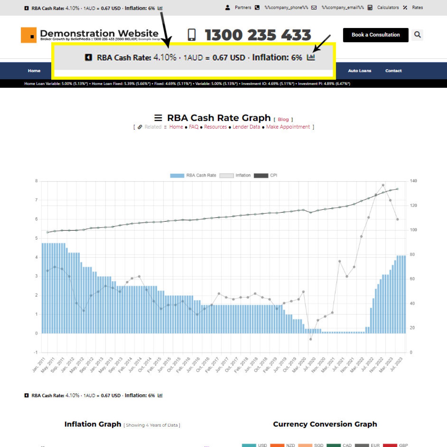
Pictured: An RBA Cash Rate graph is shown by default on a page linked to in your header. The same panel includes the Inflation figure and Currency Conversion Rate. The page linked to includes an array of graphs dispending on your website framework version.
The graph is used in a number of FAQ pages, and we often include date-ranged graphs in managed articles.
January 2026 Graph Update: The RBA Graph was updated in January 2026. An alternate shortcode is used but the second (now legacy) graph will continue to function. You can expect the 'legacy' shortcode to return the new graph by Aoril 2026. Reasons for the update are discussed below.
Inflation Graph: A standalone Inflation Graph is also available. Details are made available in an FAQ titled "How to Include an Inflation Graph with Shortcode".
The Result
Shortcode of [bm_rba_cash_graph] returns the graph below (we've used [bm_rba_cash_graph start="20140101" points="1000" height="380"].
The new chart includes (muted) trend lines for thr rate, CPI, and inflation.
It's likely that updates will continue to be applied to this graph = particularly since the RBA has started to published monthly inflation data. The change was made as a result of an updated API endpoint that provides more comprehensive data.
Shortcode Attributes
Attributes are identical to the legacy chart with the exception that we've removed the stylistic options. The tuesday attribute was rarely used and is no longer as it once was, so it was removed. Very few applied their own style to the chart, and when they did they usually struggled.... so the options were simply removed.
The Inage RBA Cash Rate Graph shortcode remains the same.
■ ■ ■
The Legacy Result [ LEGACY ]
In our case we've used the shortcode of [bm_cashrate_graph points="800" start="20000101" points="1000" height="420"] to return the following result:
In the above example we've set a large number of attributes, including the start date, maximum number of points to return, and the height. We've also excluded some of the RBA cash trading data. By default, you could simply return [bm_cashrate_graph] and a suitable default graph will be returned.
Deprecated: This chart is deprecated. When replaced, the shortcode will continue to function and simply reference the updated chart.
Shortcode Attributes [ LEGACY ]
A large number of shortcode attribute apply that'll alter the returned graph results and styles. Attributes are listed below with their default values but without explanation. If you're savvy enough to use shortcodes it's likely you'll recognise the attribute purpose:
Various attributes alter the manner in which data is returned to a user. Confused? Feel free to call us on 1300 235 433 for guidance.
inflation
inflation="0".rates_new_oo
rates_new_oo="0".rates_existing_oo
rates_existing_oo="0".rates_investment
rates_investment="0".cpi
cpi="0".points
start and end times.start
start and end date. Use as follows: start="20200601" (1st June 2020). An 8 or 10-figure time group is accepted. Should be used with an end date.end
start and end date. Use as follows: start="20200601" (1st June 2020). An 8 or 10-figure time group is accepted. Should be used with a start date.tuesday
width
width="600") will return that graph width in pixels.height
height="450".title
title="This is another title).title_display
title_display="1" to show.legend
legend="0" to hide.legend_color
rgb(80, 80, 80). Use a 6-figure HEX value or RGB value.title_padding_top
title_padding_top="30".title_padding_bottom
title_padding_bottom="20".bar_colour
rgb(62, 149, 205, 0.6). Use a 6-figure HEX value or RGB value.inflation_colour
rgb(106, 106, 106, 0.5). Use a 6-figure HEX value or RGB value.inflation_point_colour
rgb(106, 106, 106, 0.5). Use a 6-figure HEX value or RGB value.inflation_border_colour
rgb(106, 106, 106, 0.5). Use a 6-figure HEX value or RGB value.inflation_border_width
inflation_border_width="3".inflation_border_radius
inflation_border_radius="3".inflation_border
inflation_border_radius="3".rate_colour
#727272. Use a 6-figure HEX value or RGB value. The rate_colour_end should normally be the same.See also: "How to Include the Cash Rate Data as Text With Shortcode"
■ ■ ■
.Image Graph Alternative
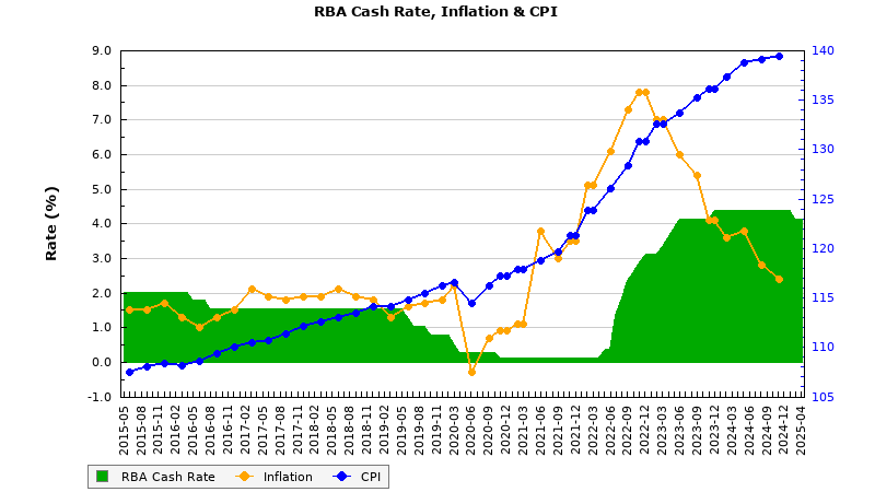
Should the graph be required in an image graph format, you should reference the LoanCalc API. The shortcode of [loancalc gt="rbablg"] returns the following:
■ ■ ■
Related Graphing FAQs
Related Graphing FAQs.
We archive about as much data as ASIC and other regulatory bodies or institutions make available. The API we make available to all clients by virtue of their assigned key provides access to a large number of resources and tools - most of which you will never use. The API itself is used to measure… [ Learn More ]
The Published versus Comparison Rate graph was created to support a single FAQ on 'What is a Comparison Rate', but the graph often finds value elsewhere. To include the graph on your page, use the shortcode of . The Result: The graph simply illustrates how the published rate is often vastly different to the comparison… [ Learn More ]
This feature can largely be ignored. This was a feature introduced to support our managed article program, and a former plug-and-play Platinum graphing block is forthcoming. It is expected that you will not use this shortcode. It should be noted that shortcode is never a good way in which to create custom graphs as the… [ Learn More ]
The exchange rate graph return major currencies compared against the Australian dollar. It's not a particularly pretty chart but the colour values may be altered by way of shortcode (we've used very different bold colours to clearly differentiate one currency from another). Inclusion is made with the shortcode of . The result: Various attributes may… [ Learn More ]
In an FAQ titled "" we looked at how to include a standard cash rate graph on your website (which included inflation and API data). This FAQ will show you how to include a standalone Inflation Graph with simple shortcode. Until the plugin update of January 2026 we used a clumsy image graph that was… [ Learn More ]
An RBA Cash Rate graph is shown by default on a page linked to in your header (image below), although the graph may be shown anywhere, and its presentation may be altered in a large number of ways. The graph is used in a number of FAQ pages, and we often include date-ranged graphs in… [ Learn More ]
The 'ImageCalc' graphing tool was initially designed to easily integrated graphs into automatically generated PDF documents. It has since been used by brokers in their articles because of its ease of use. The most common methods of including the graphs into standard articles is with simple shortcode, while Elementor is the methods generally sued when… [ Learn More ]
We;ve had a 'Metals API' for a number of years, but not unlike Bitcoin and other data that shrouds industry discussion, it wasn't entirely relevant. However, in the January 2026 plugin update we decided to include the graph on the standalone graphing page as a result of popular discussions on the topic, and lender policies… [ Learn More ]